Fintech · SaaS concept · 2026
Pairwise
A month-end close product, explained in isometric scenes
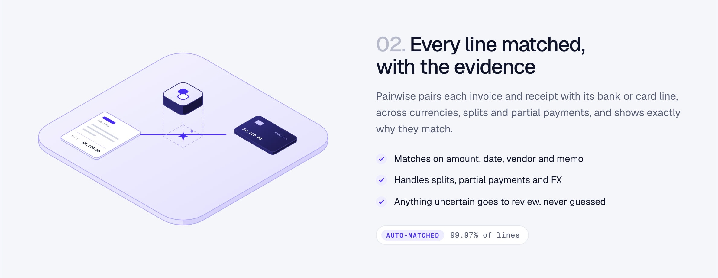
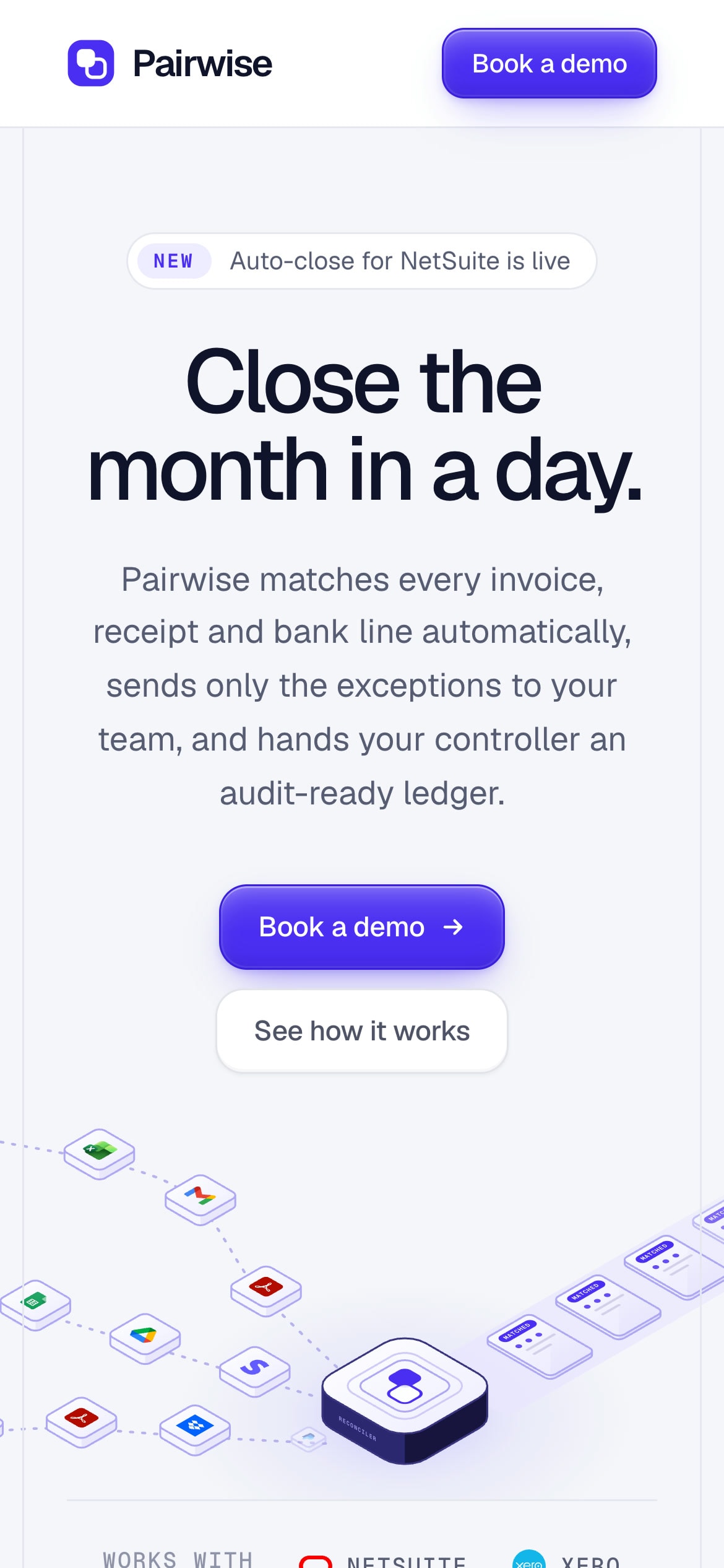
Finance software is hard to picture. Month-end close means invoices, receipts and bank lines that have to be matched, checked and posted, and most products in the space explain it with a dashboard screenshot nobody can read.
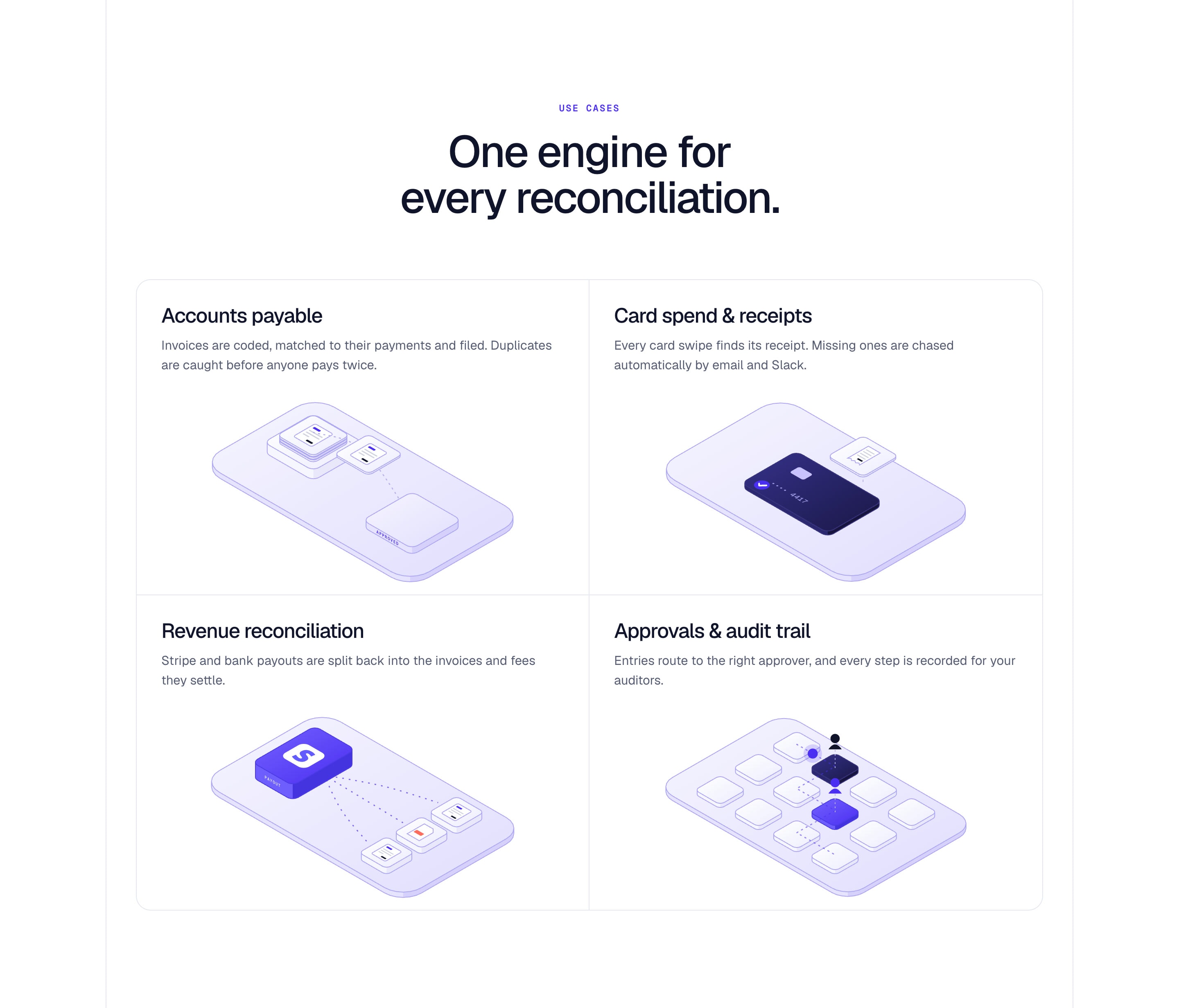
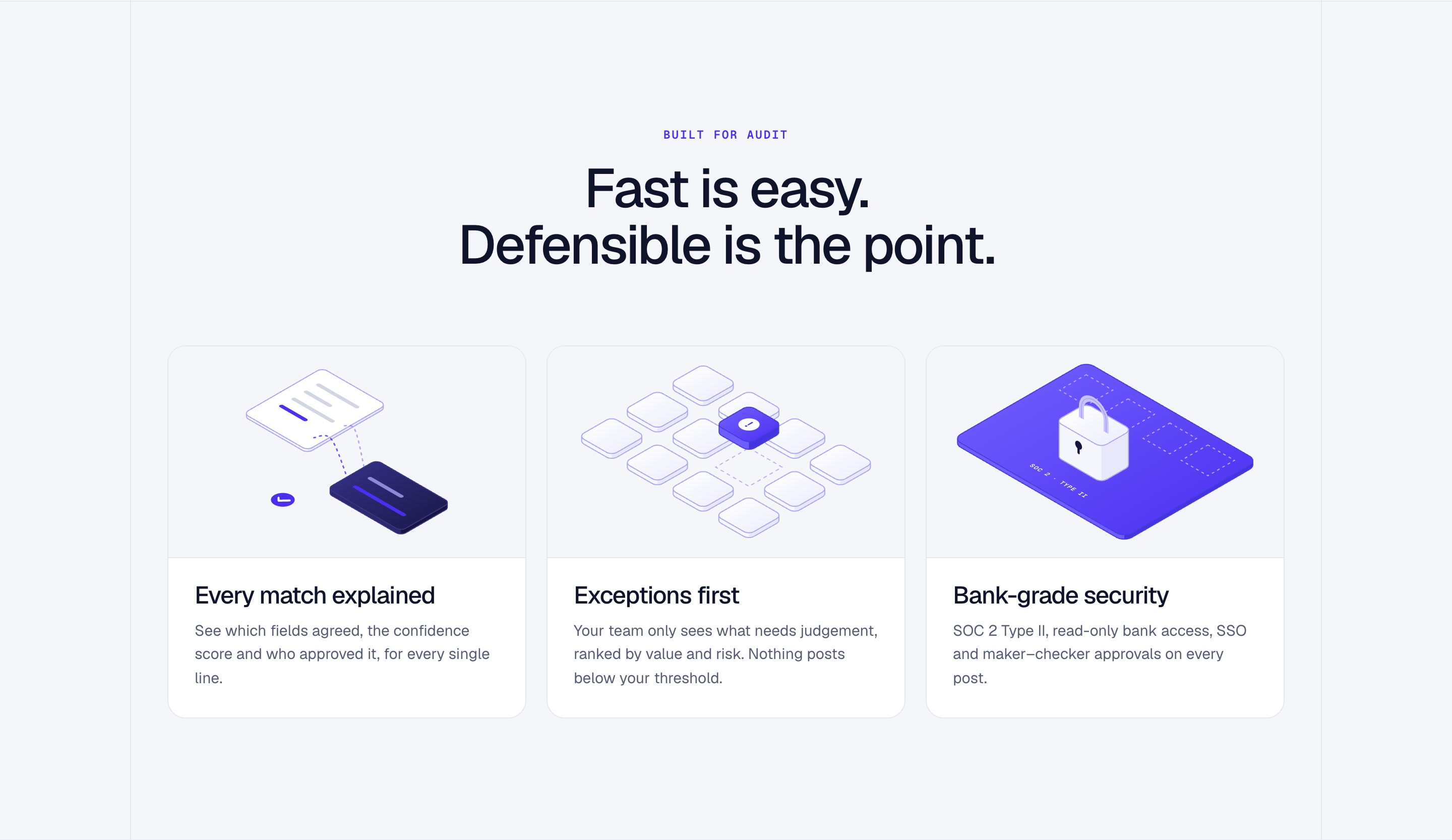
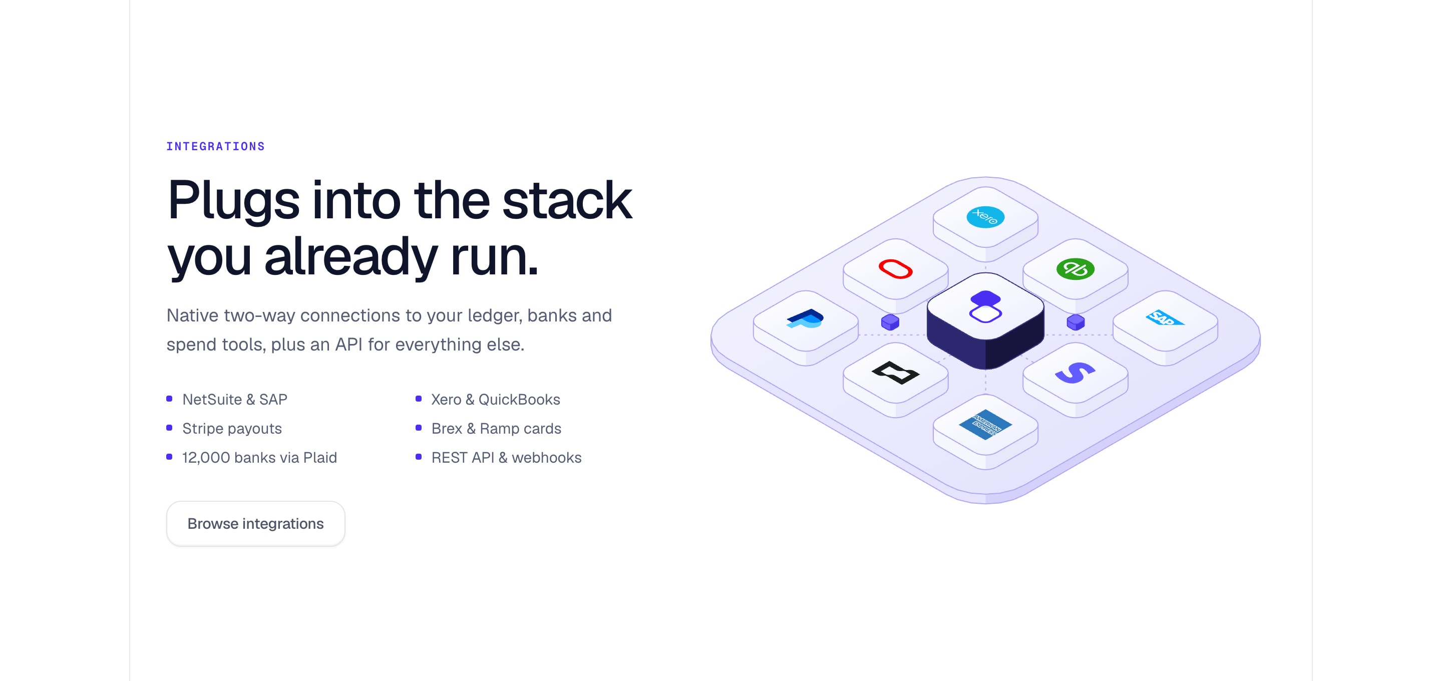
I designed and built a concept page that shows the work instead. Paperwork flows along dashed paths into one hub and leaves as matched ledger entries, and every section, from the three steps to use cases, trust and integrations, has its own isometric scene. All 13 scenes are drawn on the server from an isometric kit I wrote for the page, so they ship as plain SVG with no JavaScript, and their motion pauses when they leave the screen.
The result reads like a product you could trust with your books: calm, precise and easy to follow from the first headline to the demo button.






The decisions that made it work
Show the work, not a dashboard
Every claim on the page has a scene that shows it happening, so a finance lead understands the product before reading the copy.
One brand colour, isometric everything
Cool white, ink and a single violet, with every illustration built on the same grid, so thirteen scenes still feel like one product.
Fast without the JavaScript
The scenes are generated on the server as SVG and animated natively, so the page is fully static and the illustrations cost the browser almost nothing.