AI agents · SaaS · 2026
Orren
An AI-agent product that starts with a prompt, not a pitch
Orren deploys AI operators that plan, execute and scale workflows, from sales to support. Agent products are hard to explain in a headline, because every competitor promises the same thing.
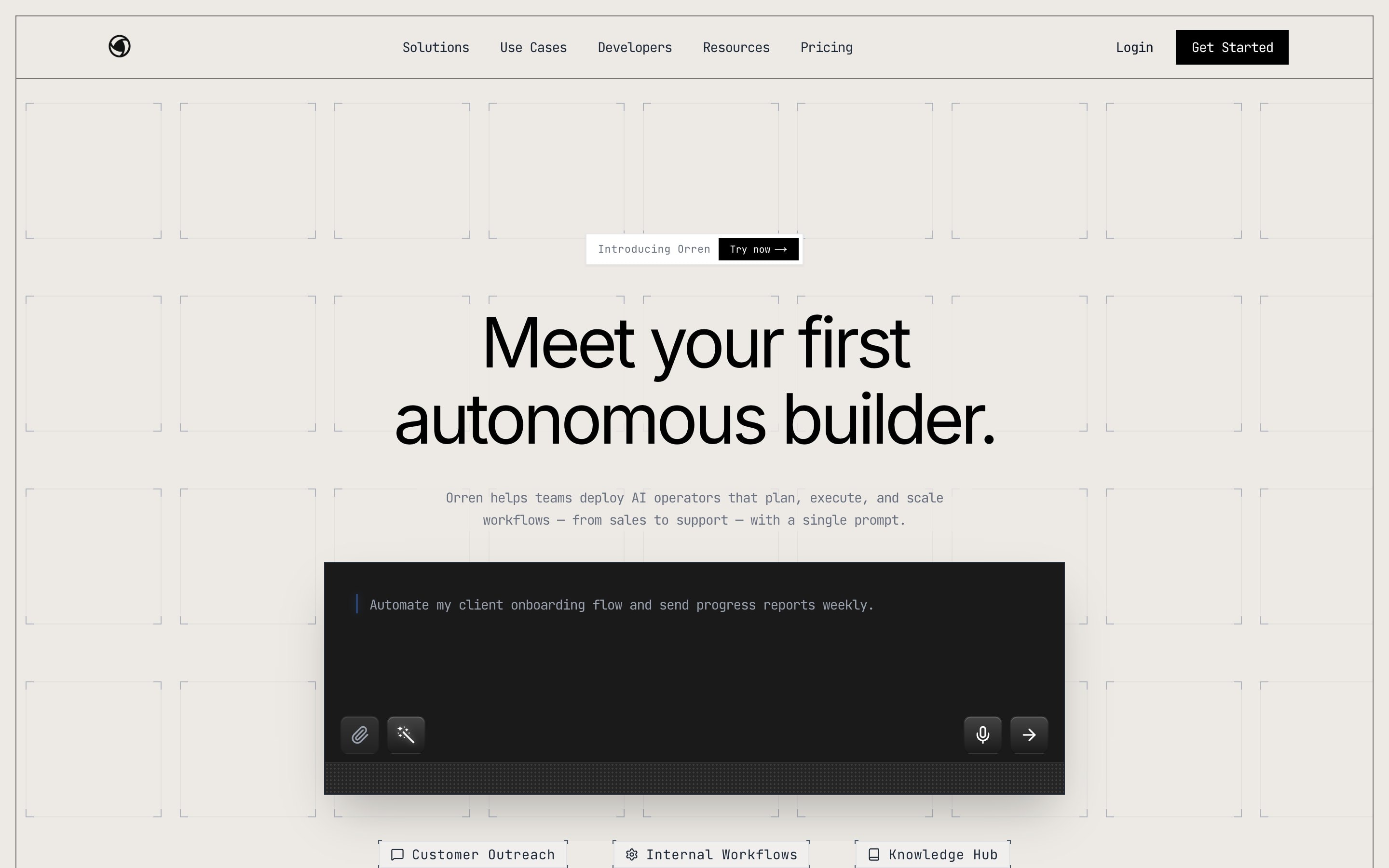
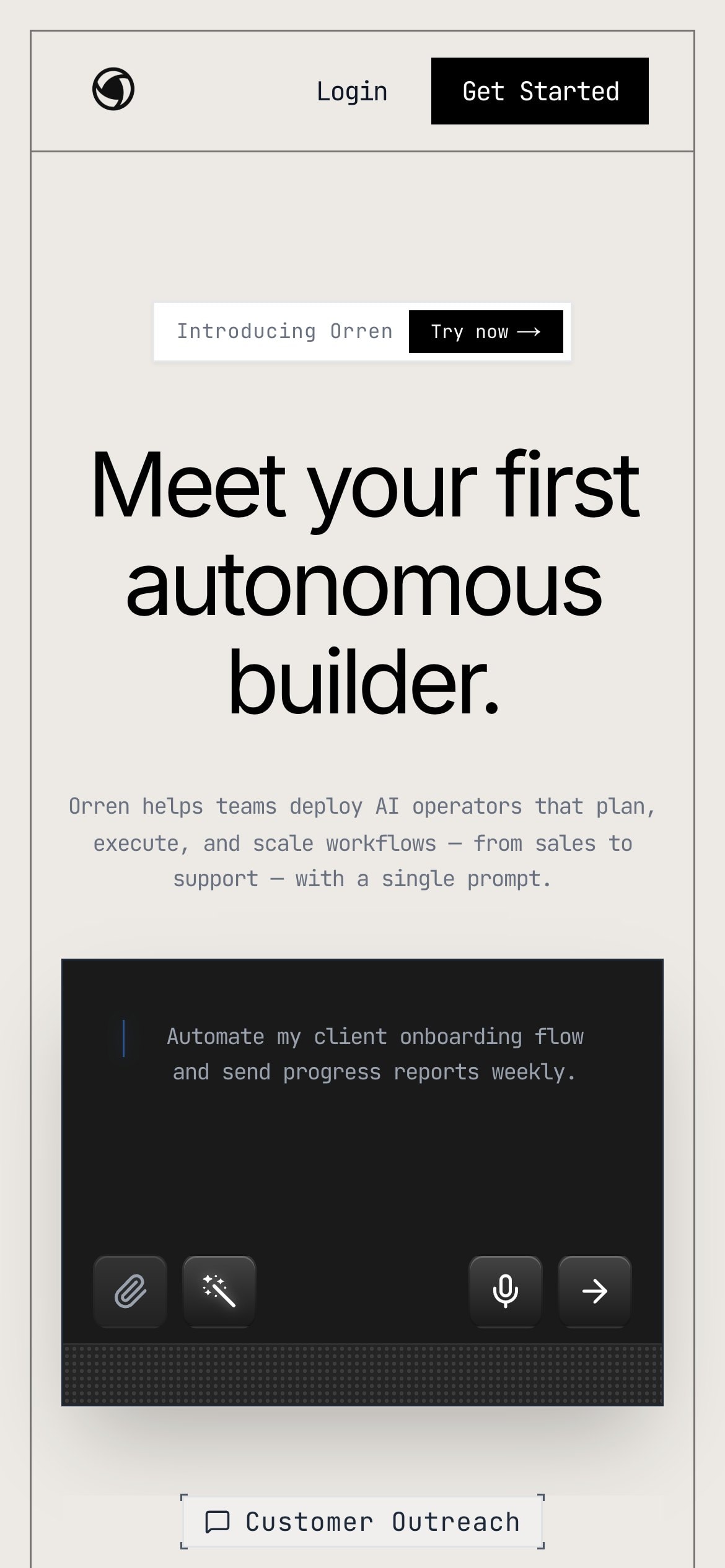
I designed and built a single, focused screen: one sentence, one line of context and a prompt box where the product starts. The use cases sit underneath as quick-start chips, so a visitor sees what to type before they read a feature list.
The page feels like the product rather than an advert for it, which is the shortest path from a visit to a first try.

The decisions that made it work
The prompt is the hero
Instead of a screenshot of the app, the first thing on the page is the input where the product begins.
One screen, on purpose
No long scroll of features. The page earns a first try, and the product does the rest.
Calm, technical texture
A fine grid, a monospace prompt and a warm off-white keep it serious without the usual dark-mode AI clichés.